rastr.ai
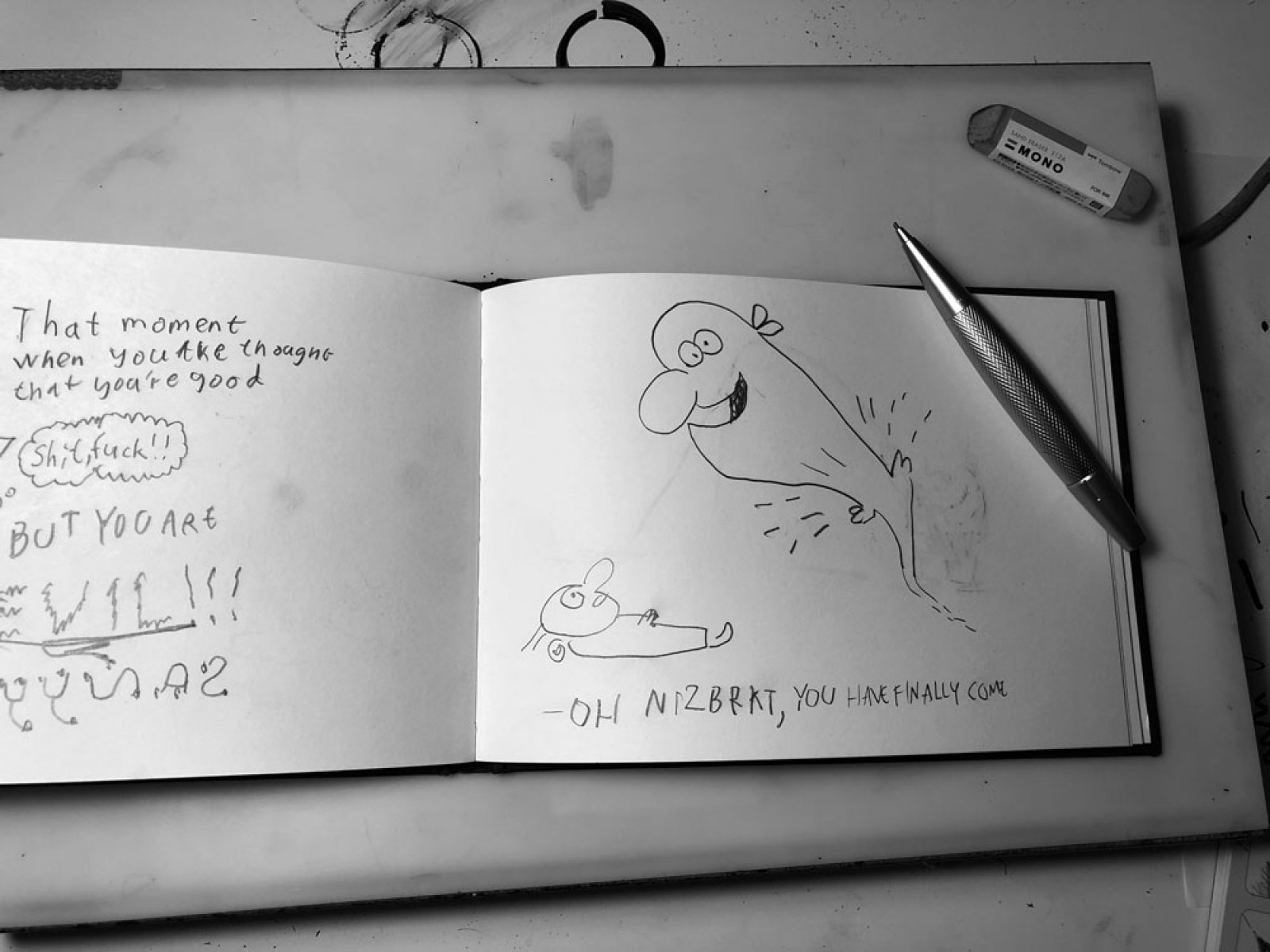
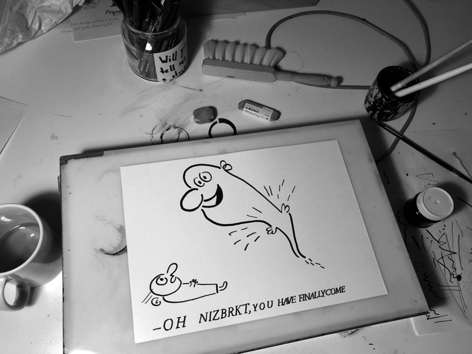
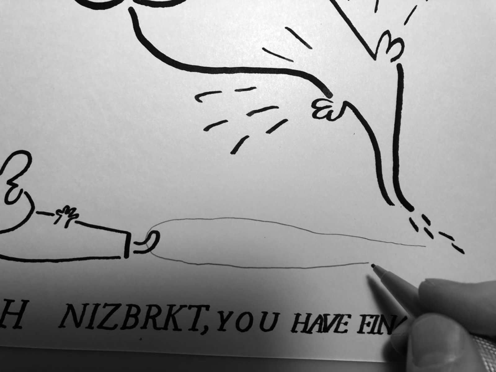
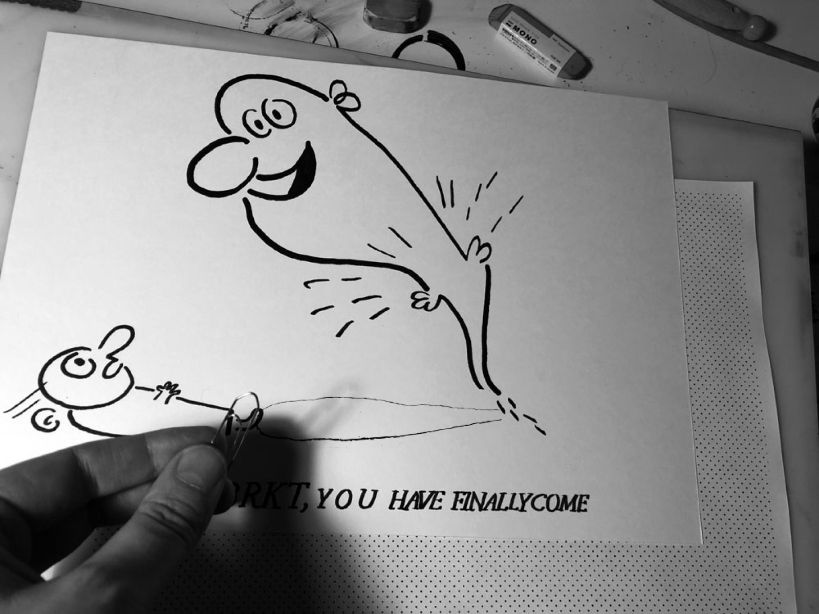
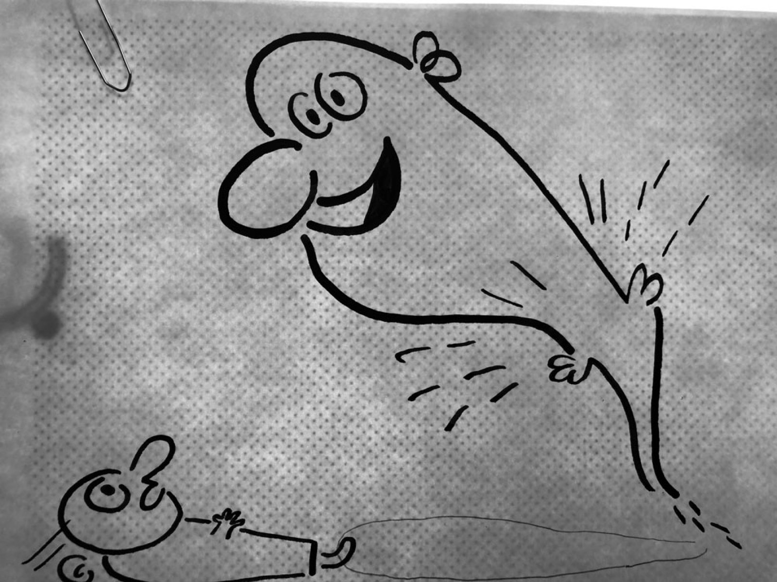
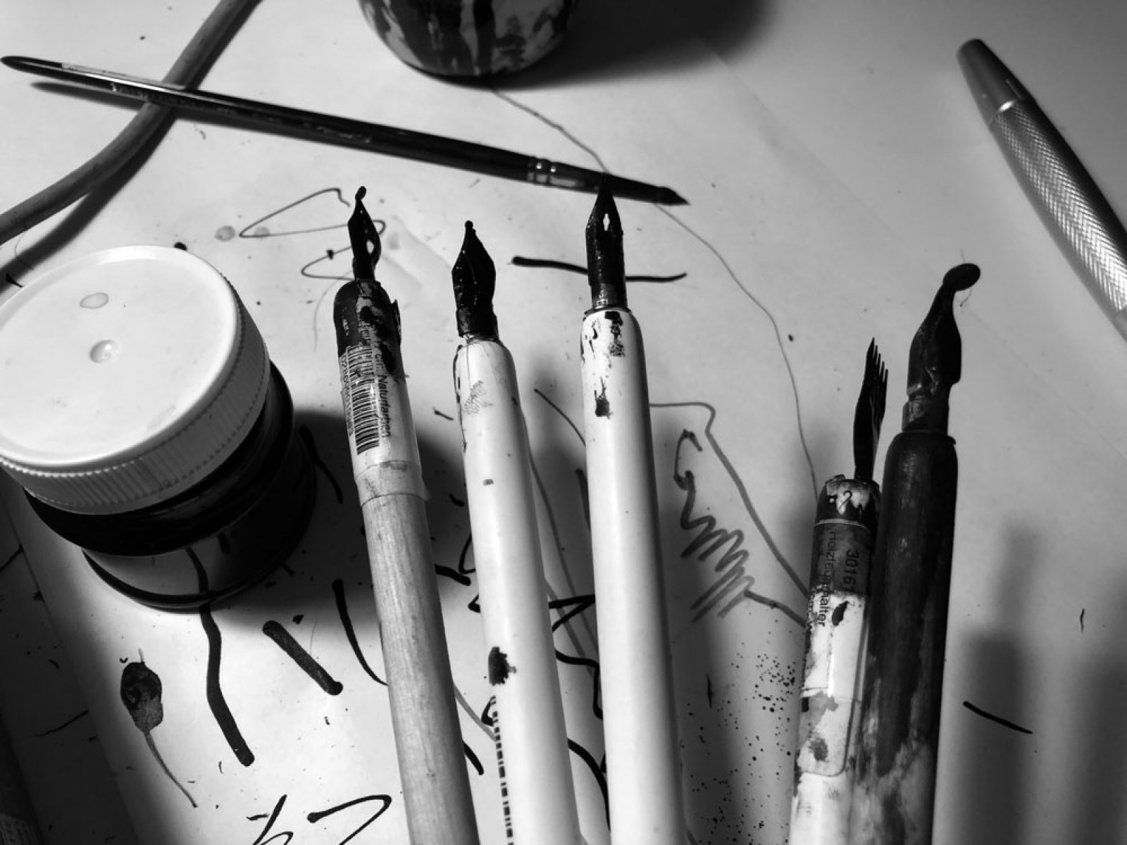
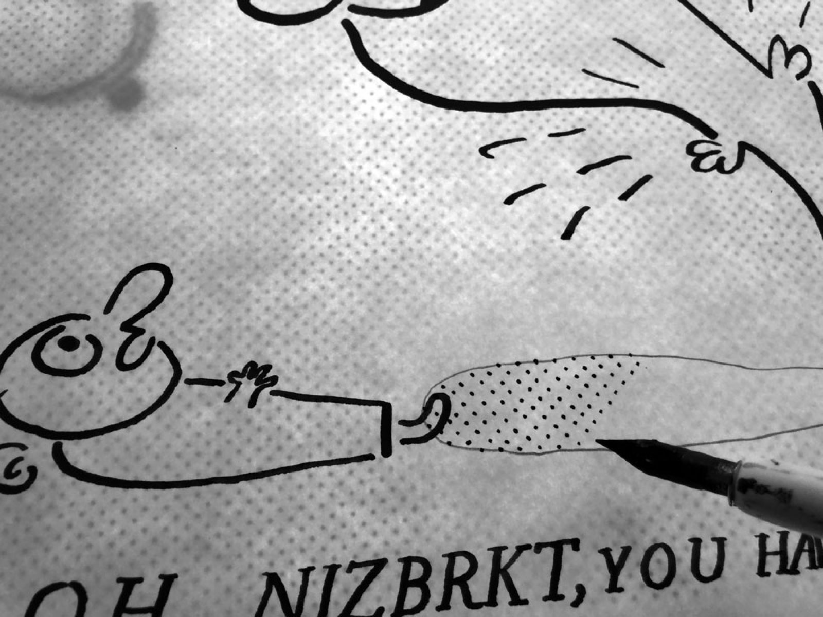
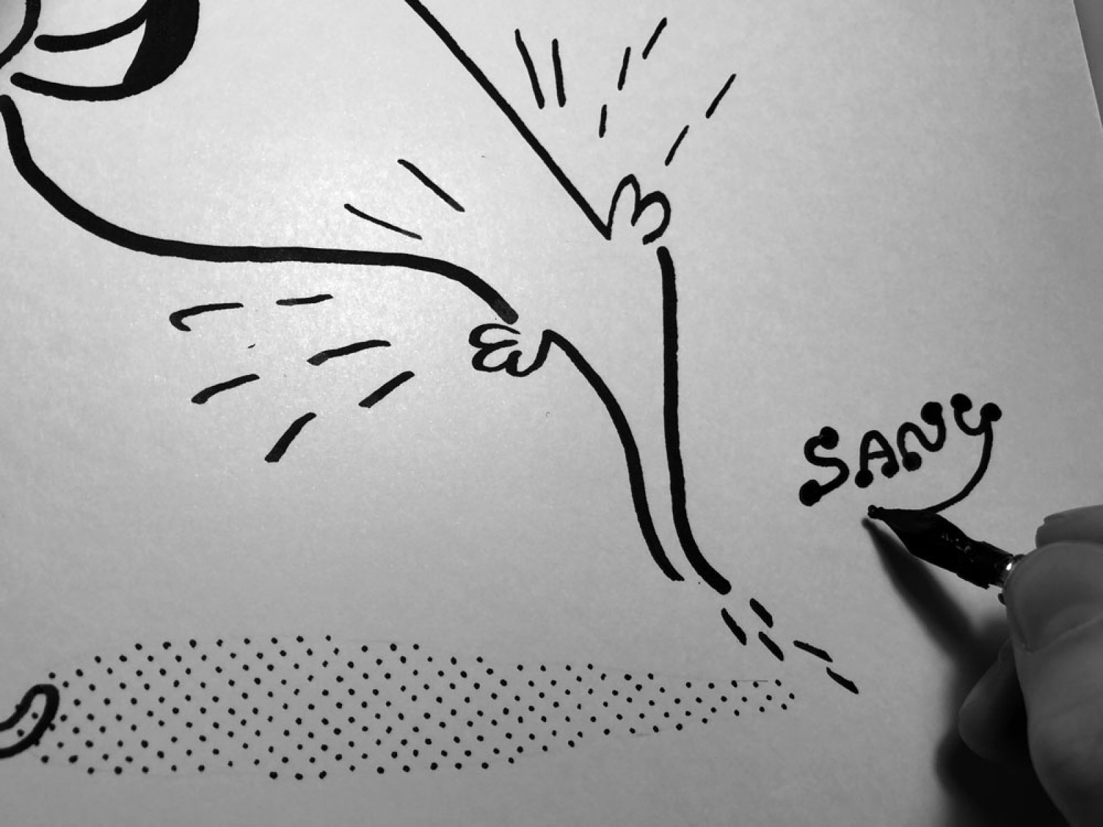
According to the Hockney-Falco thesis the advancements towards photographic realism in artistic painting during the early Renaissance were mainly due to the secretive facilitation of certain high-technological inventions, especially in the field of optics and mechanics. These techniques could then have been shared between artist in a masonic fashion, through covert arts and crafts corporations at the time, but still kept the general public stupendously mesmerised before the stunning brushstrokes of the Master.Even in our days of scientific and technological worship, we stubbornly persist in the romantic notion that artistic virtuosity must be given in the form of a divine blessing, rather than through the nifty appliance of modern technology.In the western artistic tradition it is not regarded a virtue to copy someone else’s style or technique, which is probably also why we are not so keen on sharing our best tricks with each other. It may then certainly be debated to what degree we can claim to own anything at all, be it a special use of a technique or even a stylistic expression, but as designers and artists today, originality and copying are, nevertheless, issues that will inevitably claim a disproportionate amount of time and energy from our creative practice. My own included.However, what I have come to realise at recent occasions of being exposed to the act of copying is, that it’s not someone else profiting from my labour that particularly annoys me, but that the imitations are often so poorly executed.That’s why I have now decided to share one of my most precious tricks how to make an ink drawing look nicer, more professional, but still with a crafted and imperfect touch. In other words how to add that special ”Sany” flair to your work.”What deserves to be done, deserves to be done well” is a proverb that runs in my family and was inherited to me from my beloved grandmother Elsa Nyholm. In her honour, by this motto: if someone would consider it worthwhile to copy my style, I will from now on offer a guide how to do it with panache. This may be regarded my most modest contribution to a more bareable world, and at the same time an indulgence to aby for the times I have myself been overly "inspired" by someone elses work. All for the benefit of the greater (common) being.
Created on
Mon, 12/02/2019 - 14:07
Changed on
Mon, 03/23/2020 - 13:16
DOI
10.26017/tda-395
Published
On
Subtitle
Deterministic stippling
Sticky
Off
Path
rastrai